BioMedStatX
BioMedStatX User Guide
This guide explains how to use the BioMedStatX application: from launching the program, importing data, running statistical analyses, customizing plots, and exporting results. All information is focused on the user interface, available statistics, and practical workflow—no programming or code knowledge required.
1. Launching the Application
- Locate the
BioMedStatX.exefile in your installation directory. -
Double-click to start. A Qt-based GUI window will open with the menus: File, Analysis, and Help.
2. Importing Data
- In the File menu, select Browse to choose your data file (Excel
.xlsx/.xlsor CSV.csv). - For Excel files, select the worksheet you want to analyze. For CSV, this step is skipped.
- Click Load to import your data into the application.
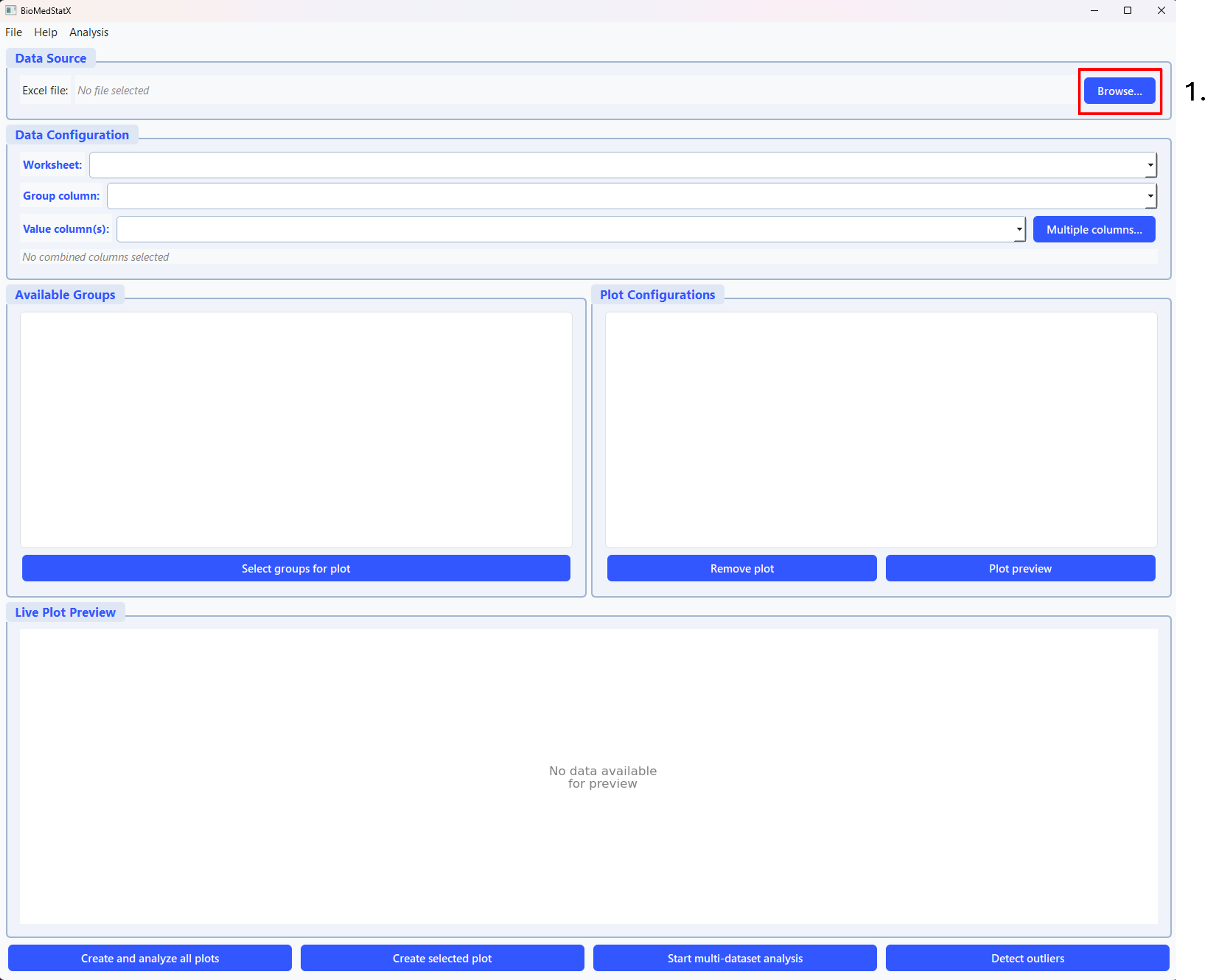
Step 1: Click the “Browse…” button (highlighted in red, number 1) in the top right to select your Excel or CSV data file. This is the first step in the workflow and starts the data import process.
3. Selecting Groups & Measurement Columns
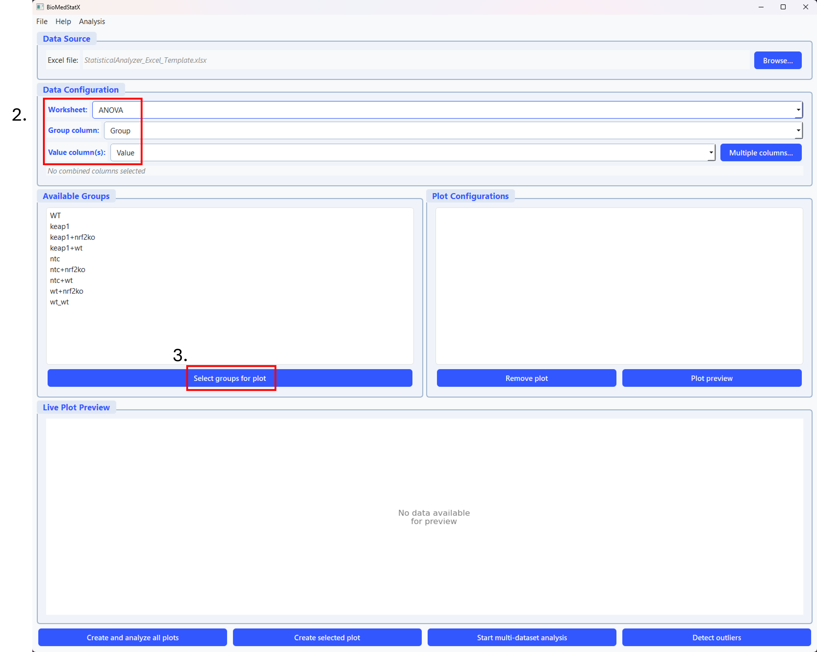
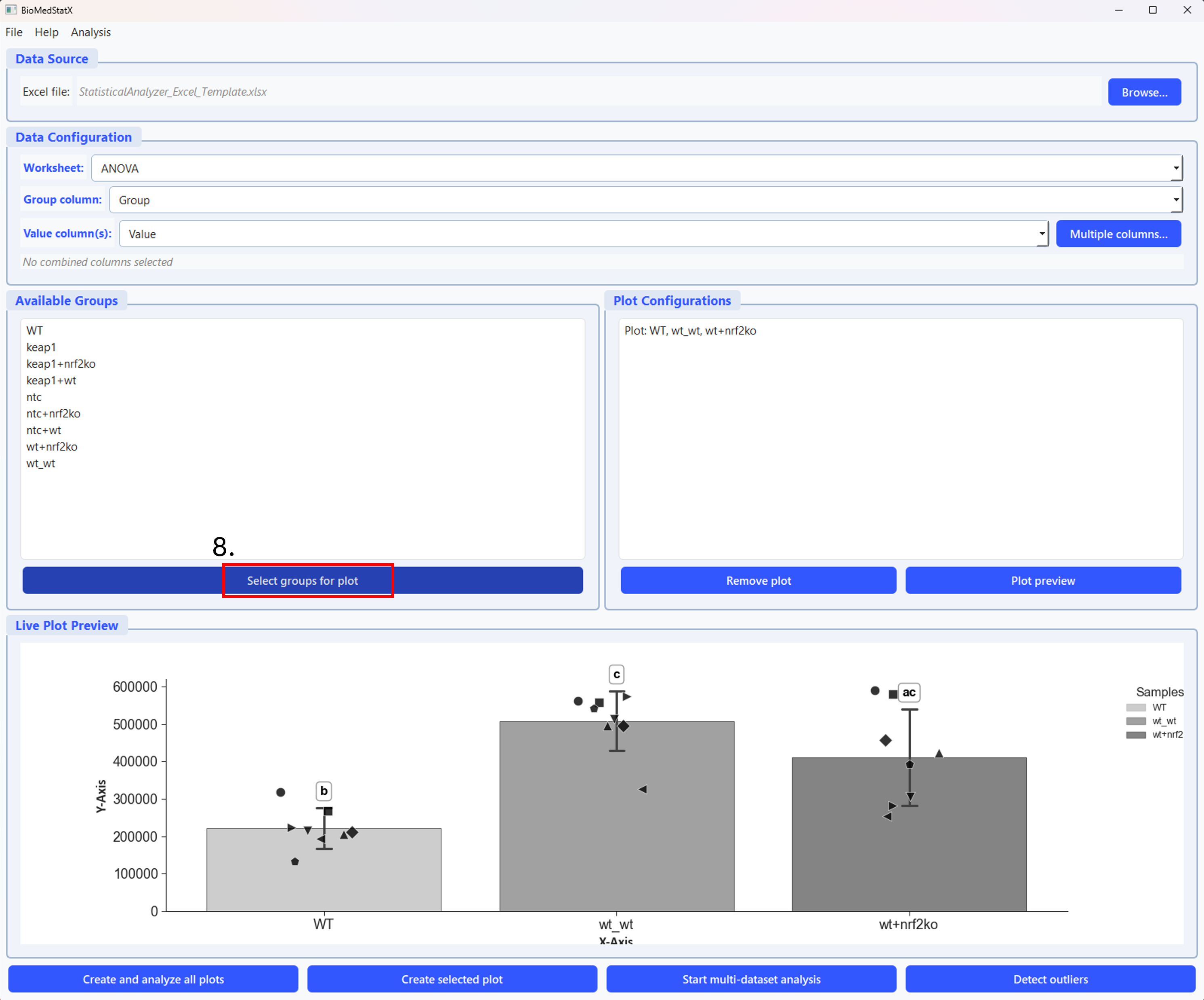
Step 2: First, select the worksheet, group column, and value column in the Data Configuration section (number 2 in the picture). Then, click the “Select groups for plot” button (number 3 in the picture) to choose which groups to include in your plot.
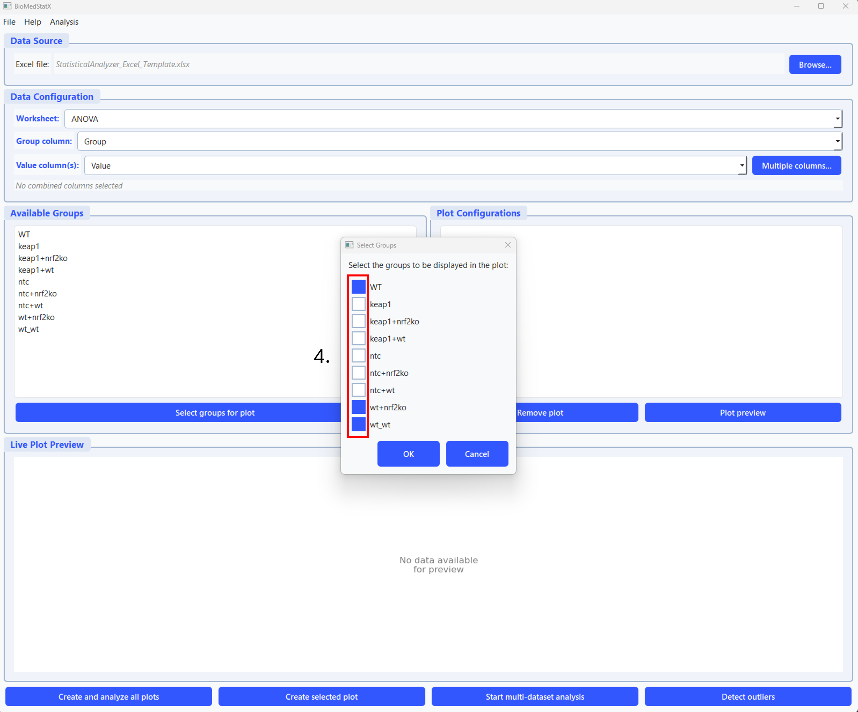
Step 3: In the group selection dialog, select the groups you want to display in the plot by checking the boxes (number 4 in the picture). Then click “OK” to confirm your selection.
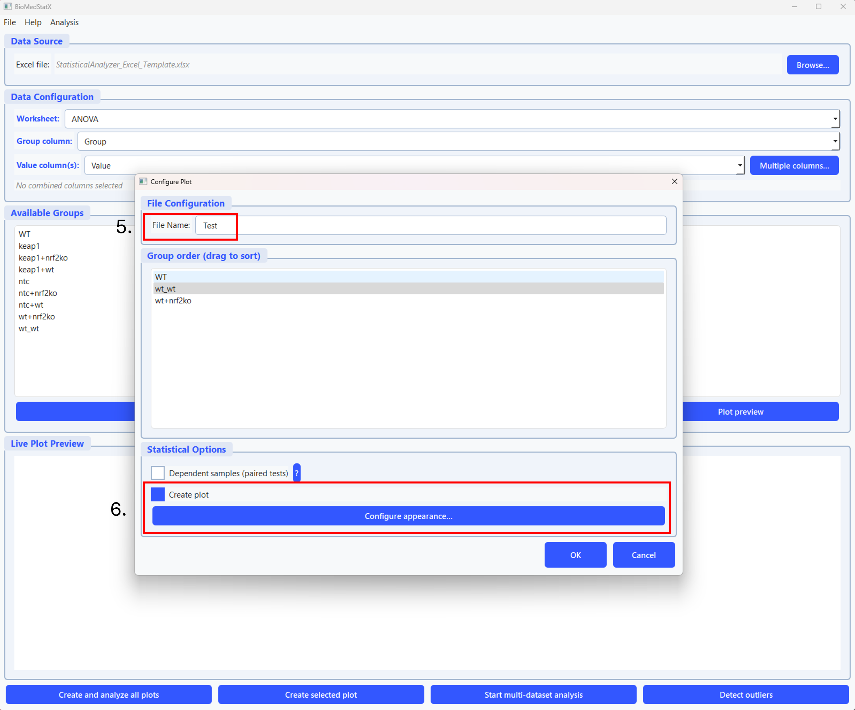
Step 4: In the configure plot window, you can set the file name (number 5 in the picture), change the group order, select if the sample are dependent and select if you want to create a plot (number 6 in the picture). If you do not create a plot, the analysis results in the comprehensive excel sheet only.
4. Plotting & Customization
BioMedStatX creates publication-ready plots for your results. Supported plot types include:
- Bar charts (with error bars)
- Violin plots
- Boxplots
- Overlayed individual data points (with lines for paired data)
Plot Customization
Use the Plot Settings dialog to adjust:
- Plot title and axis labels
- Figure size (width, height, DPI)
- Colors and hatches for each group
- Error bar style (SD/SEM, caps/lines)
- Significance annotations (letters, brackets, custom comparisons)
- Legend position, font size, and title
- Background and grid style
- Data point style (jitter, strip, swarm)
- Overlay options (paired lines, custom annotations)
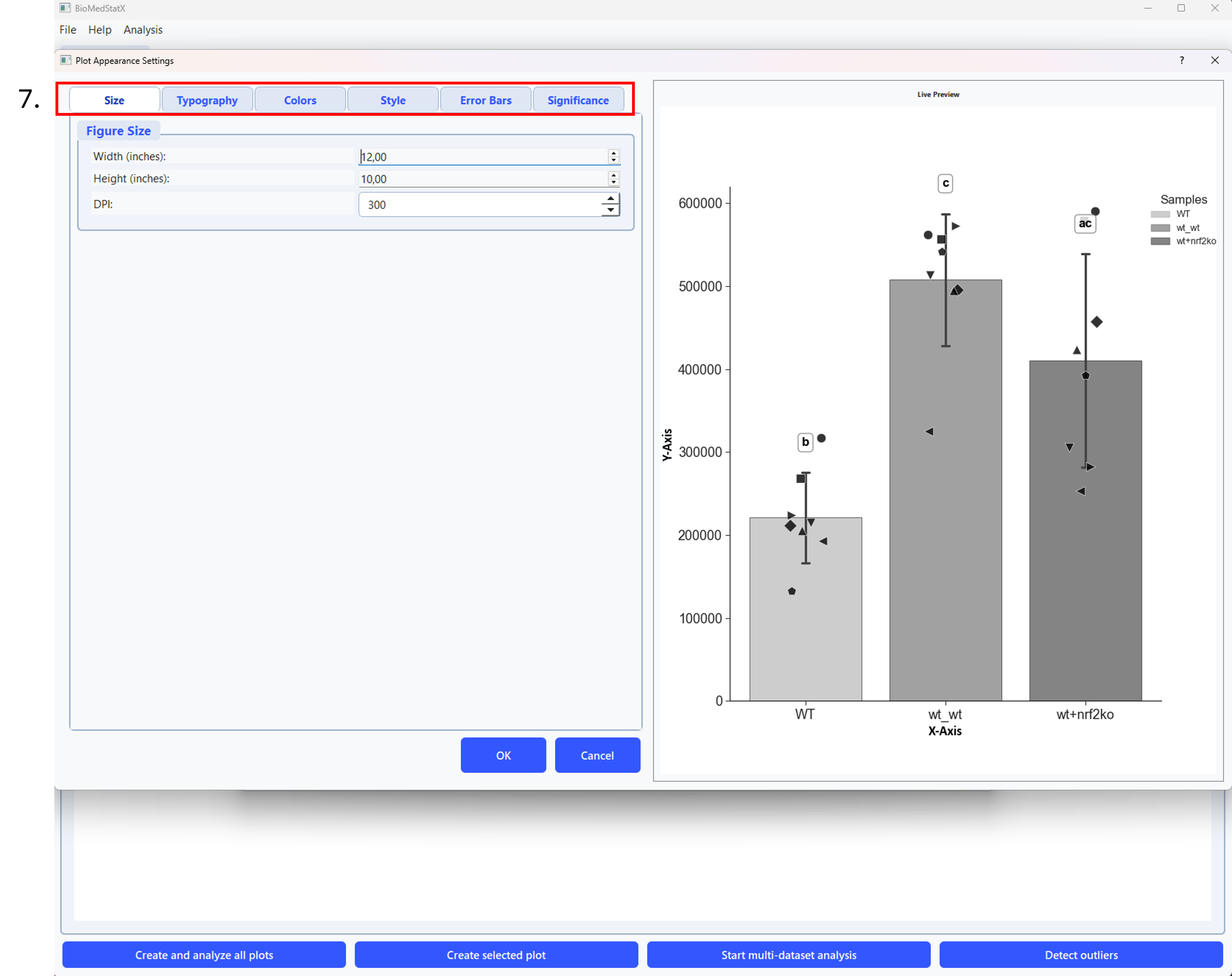
Step 5: In the plot settings dialog, adjust titles, axis labels, colors, error bars, and more. Preview changes and save or export the customized plot. All changes are shown in a live preview before saving.
Step 6: It is possible to create different plots from the same dataset if needed (number 6 in the picture).
5. Statistical Analyses
BioMedStatX automatically selects the appropriate statistical test based on your data and design. Supported analyses include:
- Two-group comparisons (independent or paired)
- Multi-group comparisons (one-way, two-way, repeated measures, mixed designs)
- Parametric and non-parametric alternatives (e.g., t-tests, ANOVA, Mann–Whitney, Kruskal–Wallis)
- Advanced ANOVAS (TwoWay, Mixed, Repeated-Measures)
You do not need to choose the test yourself—the software guides you and explains the result in plain language.
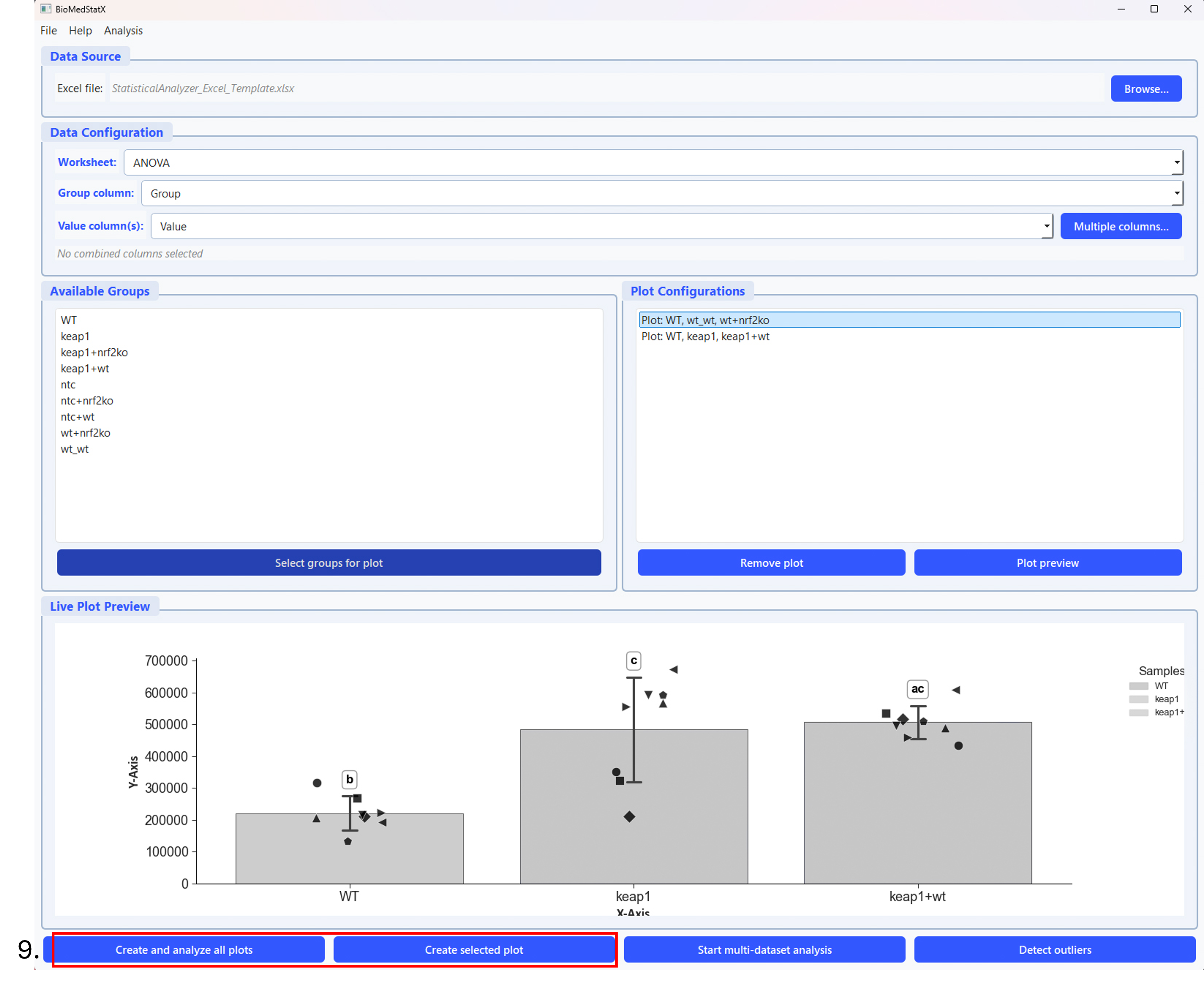
Step 7: Click the button (number 9 in the picture) to start the analysis. You can analyse the selected plot or create and analyze all plots.
6. Assumption Checks & Data Transformations
Before any statistical test, the app automatically checks for normal distribution and equal variances. If your data does not meet these assumptions, you will be prompted to apply a transformation (log, Box–Cox, or arcsine–sqrt) to improve suitability for analysis. You can skip or accept the suggested transformation.
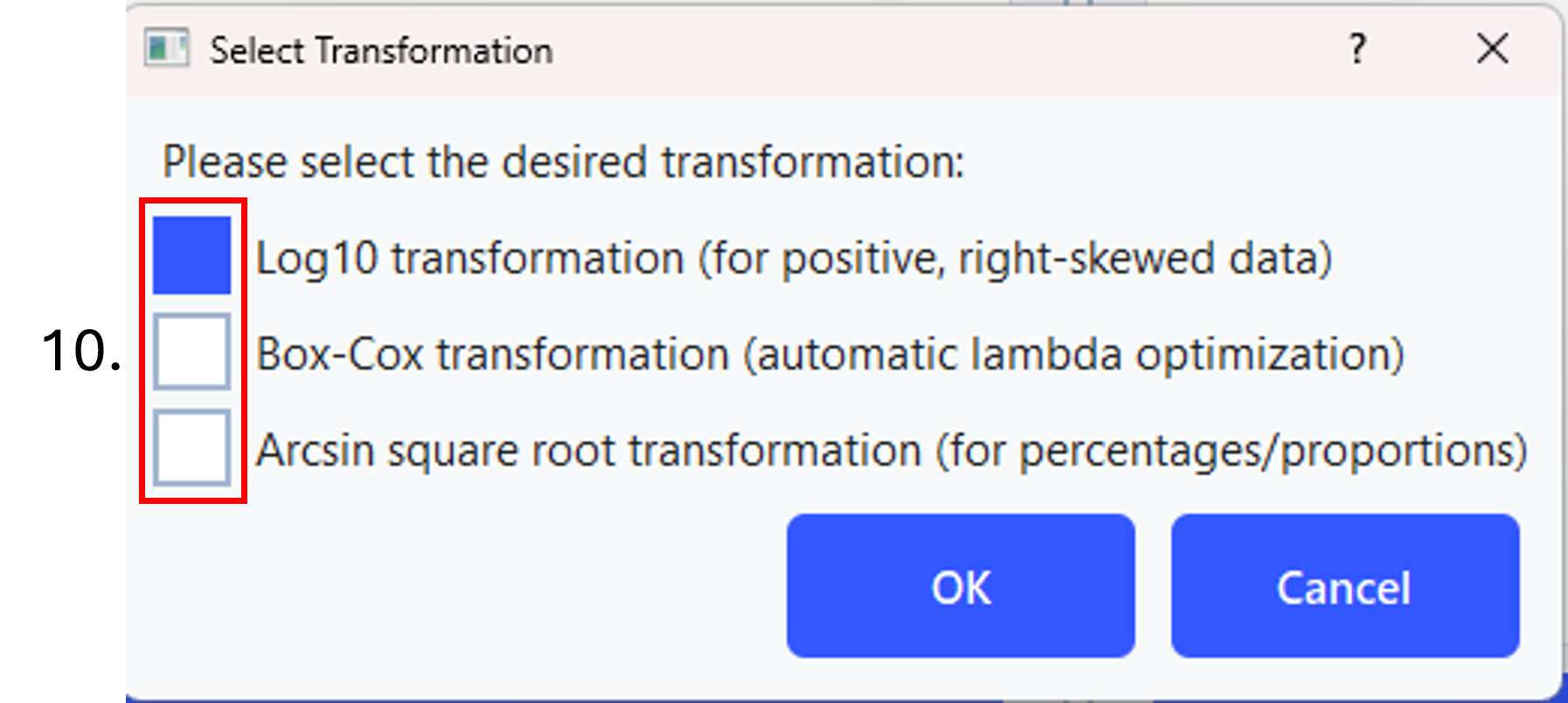
Step 8: If the assumptions for a parametric test are not met, choose one of the three possible transformations (number 10 in the picture).
7. Post‑Hoc Comparisons
If a group comparison is significant, the app automatically performs post-hoc tests (e.g., Tukey, Dunn, Bonferroni, or Dunnett) to show which groups differ. Results are clearly displayed in the results table and as annotations on the plots.
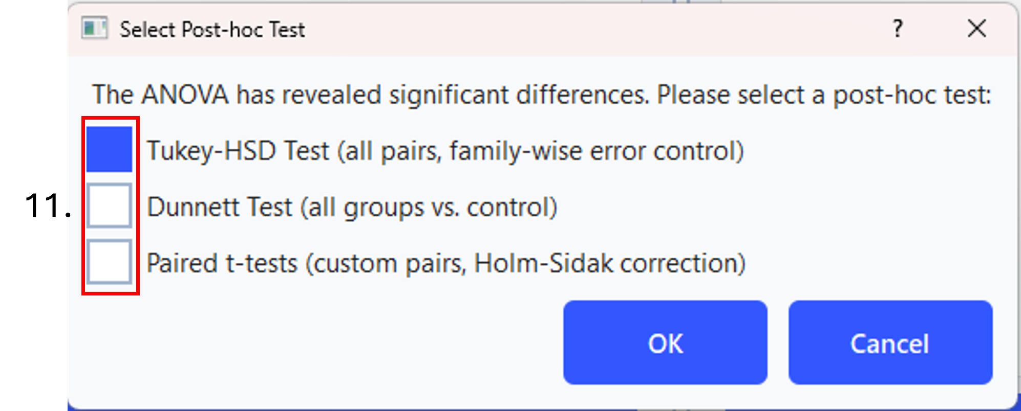
Step 9: After the parametric or non-parametric test was performed and revealed a significance, you need to choose on of the post-hoc tests (number 11 in the picture).
8. Decision Tree Visualization
The statistical decision process is visualized by a decision tree. The app displays a graphical flowchart showing which tests were chosen and why, with the actual path highlighted. The image is included into the excel workbook.
9. Exporting Results
After your analysis, all the results are exported automatically in a comprehensive excel file. The exported file contains:
- A summary of all tests and p-values
- Assumption checks
- Main results and effect sizes
- Descriptive statistics for each group
- The decision tree image
- Raw data snapshots
- Pairwise comparisons
- A chronological analysis log Each sheet is clearly named for easy navigation.
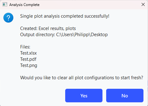
Step 10: Final message after a successful analysis.
10. Outlier Detection (Optional)
Under Analysis → Detect Outliers, you can identify and flag outliers in your data using:
- Modified Z-Score Test
- Grubbs’ Test
- Single-pass or iterative mode
Results are exported to Excel for further review.
11. Multi-Dataset Analysis
If you load an excel file with a group coloumn and several value coloums (e.g. different genes from a RT-qPCR) is is possible to analyse all the genes in one go.
- Load the data as explained.
- Choose the “Multiple columns…” button.
- In the Select Measurements Window select the “Separate analysis per dataset with shared excel file” and the datasets you want to compare
- Next, click on the Start multi-dataset analysis button and now the application follows the same workflow as for a single analysis
12. Quick Workflow
- Launch the application.
- Browse and Load your data file.
- Select worksheet (if Excel), group column, and measurement columns.
- Choose analysis type (basic or advanced).
- Check assumptions; apply transforms if needed.
- Review plots and decision tree.
- Export results; locate your results files in your working folder.
Tips & Best Practices
- Ensure your group column has consistent, non-empty labels.
- Use data transformations for highly skewed data if prompted.
- For paired designs, confirm equal sample sizes per group.
- Use the Analysis Log sheet in the exported Excel file for troubleshooting and detailed steps.
- Preview your plot settings before exporting for best results.
Happy analyzing!